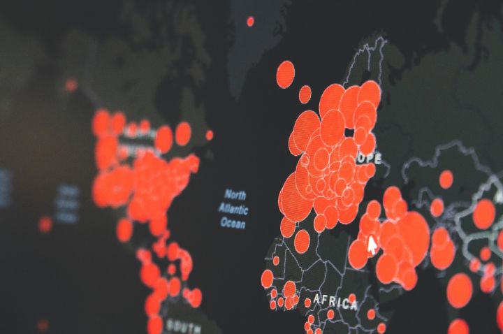
The last time our earth experienced a pandemic of this scale, there were not as many lines, curves or numbers to interpret. But today we have an abundance of data, and it is negligent, if not ignorant, not to pay attention to insights from the frontline to better understand this absolute disruption to our everyday life.
Let us begin with the increasing line, the number of confirmed cases. Each time the laboratory test for the virus that causes COVID-19 returns a positive result, the number of confirmed cases goes up by one. If we draw a line representing the number of confirmed cases per day, we obtain a daily infection rate. Now if this line keeps increasing, that means the virus continues to spread. If the line tends to increase rapidly, what we visualise on a graph is not a line, but a curve – technically a shift from linear to exponential increase.
Many social distancing and self-isolation measures have been enforced to halt this spread. We can verify if these measures are effective and individuals are abiding by these measures, when the curve flattens or tends to decrease. A flattening (or decreasing) curve is particularly important for our healthcare systems, because we only have a finite number of beds (and other services) to treat the critically ill. This is supply and demand - when the supply (of beds) is a fixed digit, a demand beyond that number cannot be accommodated.
A curve that is flattening should be good news, but there is a catch. If we return to the number of confirmed cases, now this variable is only as good as the number of tests that have been conducted. If we think of the test as an end of semester exam, all students must sit the exam but not the lecturer. However, this does not mean the lecturer will not pass the exam, it is simply irrelevant for the lecturer to take the exam. We do not have this luxury of irrelevance with COVID-19, as there are reported instances of community transmission of the virus. The trace-and-test of travellers returning from overseas introduces a selection bias that overlooks this case of community transmission, especially of a virus that survives on dormant surfaces for hours or even days.
I mentioned a decreasing line at the start, this line depicts the health of our economies. The primary metrics of any economy; the interest rate, employment rate, and the performance of capital markets have been in steady decline since the pandemic was declared. A flattened and/or decreasing pandemic curve that is sustained over several weeks, if not months, will be an indication of the next phase; where the trajectories of the two lines reverse, as we return to health in our communities, and our economies.
One last line, before we wrap up - your personaltimeline. As we’re all too aware, our timeis a finite resource. During this shutdown you have the rare opportunity of exclusively deciding the “trajectory of your timeline”. Is it upwards or downwards? Choose wisely - at the very least, explore the data, understand the analytics, interpret the insights and know your pandemic.
Media are welcome to re-publish this article with attribution to Dr Daswin De Silva, La Trobe University.
Read more COVID-19 opinions and expertise from La Trobe academics here.