How recognisable? In 1987 militants kidnapped Terry Waite in Beirut. Years of solitary confinement followed. When Waite asked his captors for a book, he decided the best way to transcend language barriers, and the best way to ensure he received something decent to read, was to draw the Penguin logo.
Now part of the global Penguin Random group, and with thriving subsidiaries in Europe, China, India, the Americas and Australia, Penguin Books is the world’s best-known publishing imprint. Its rise to prominence and profitability was anything but inevitable; but in attaining both ends, it transformed the way that the public read, and the way that publishers use the intellectual property system.
Like many famous brands, Penguin sprang from humble and precarious circumstances. In the early 1930s, three brothers—Allen, Richard, and John Lane—were working at their family firm, The Bodley Head. At the end of the 19th century, that firm had published ground-breaking and somewhat scandalous books in London and New York. By the time of the Great Depression, however, the imprint was increasingly crusty—and on the way to bankruptcy.
The Lane brothers needed a lifeline. In the 1930s, a typical, new hardcover volume cost seven shillings and sixpence, a price that made them an unaffordable luxury for many readers. The brothers decided to launch a new venture from within The Bodley Head: a series of paperbacks that would sell at the remarkably low price of sixpence.
The brothers launched the series with an initial tranche of ten titles. The sourcing of the ten texts was a key part of what made the new venture innovative. The Lanes negotiated with rival publishers to sub-lease the paperback rights for titles that had previously appeared in hardcover. Of the first ten titles, six came from Jonathan Cape, one from Chatto & Windus, one from Benn, and the remaining two from The Bodley Head. Though privately Cape wished the new venture well, his public line was that the Lanes would certainly fail and, he said, “I thought I’d take four-hundred quid off you before you did.”
The brothers’ effort to convince hardback publishers to agree to a paperback appearance under someone else’s imprint foreshadowed the kind of copyright licensing that is now a mainstay of media and consumer industries, such as film-making and toy manufacturing. And—similar to Lego’s debt to Kiddicraft and Barbie’s to the Bild Lilli Doll—the new imprint copied a foreign predecessor.
Founded in 1932, Albatross Verlag was owned by a South African and managed through an Italian chairman and a British holding company. From Germany, Kurt Enoch controlled marketing and distribution; in Paris, Max Wegner handled editorial and production; and the firm’s German designer, Hans Mardersteig, was based in Italy. For tourists and continental readers alike, Albatross published the best of modern literature as well as popular fiction—but in English, and in paper covers.
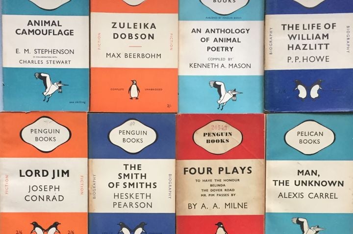
Each genre in Albatross’s Modern Continental Library had its own cover colour, so customers knew straightaway what they were getting. The Lanes saw the value in the way that Albatross issued its books, and soon appropriated multiple aspects of that company’s design: the format, the paper covers, the colour coding, the simple sans-serif titling. They even copied the ornithological branding.
To settle on the precise brand for their new series, the brothers convened a conference meeting and invited members of The Bodley Head’s editorial and sales staff to participate. The attendees assembled a long list of potential names, then subjected them to a gruelling selection process to arrive at a winning name and logo. Albatross was naturally the starting point for the long list. But what comparable real or imaginary creature might best capture what the Lanes were trying to do, and serve as title, logo, and emblem for the new venture? Among the names considered were “phoenix,” “kiwi,” and “woodpecker.”
For many reasons, penguins were in several minds at the meeting. The London Zoo’s ultra-modern penguin enclosure had just opened, its well-dressed inhabitants featuring prolifically in the press. In 1925, The Bodley Head had issued Anatole France’s Penguin Island. Tudor had published Stuart Palmer’s The Penguin Pool Murder with a striking penguin blocked on the cover. There were penguin-branded chocolate bars and sports teams, and “Squeak the Penguin” was one third of a much loved comic strip. In other forms, too, penguins had colonised the popular imagination. Around the conference table, the name “penguin” was ready to leap from the tips of several tongues.
The brothers sent Edward Young to the Zoo to sketch penguins. It was a hot day and he complained that the birds stank. Back in the office, he presented the Lanes with his (odour-free) drawings. Only then was the name for the series settled upon.
The Penguin brand, and indeed the whole Penguin package, was immediately successful. People vacuumed up Penguins as quickly as new titles could be issued. Within four months of the imprint’s launch, sales reached one million copies. Within a year, they surpassed three million. In the firm’s first decade, the Lane brothers would sell a hundred million paperbacks.
There is a huge significance to intellectual property for this enormous success, one that sounds in trademark law and branding, not in the usual copyright law that we expect with books. Purchasers of Penguins were immediately doing something new: they were “buying on imprint,” on their acceptance of the brand, as much as on author, subject, or genre. University lecturers might have routinely bought the latest Oxford University Press titles, and romance readers might have flocked to the latest Mills and Boon; but, in general, it was rare for customers to buy consciously on the strength of the publisher’s brand.
Penguin embraced this new practice of imprint buying. The firm pioneered the use of “shops within shops”: large and stylish displays of exclusively Penguin books, to be set up inside bookshops. In its marketing, the firm playfully showcased the Penguin brand, seeking to make it a signal of accessibility and also excellence. According to the firm’s corporate marketing, the “bird in the oval represents an assurance of integrity and quality to readers around the world.”
Just as the Lanes had copied Albatross, so the success of the new imprint attracted a flock of imitators. Knock-offs sprang up all over the world, even in Britain. Hutchinson’s Pocket Library, for example, copied Penguin’s stripes, binding, dust jackets, typefaces, and price.
The Penguin brand had become a valuable piece of intellectual property, separate from the books. And yet the Lanes’ attitude to the brand was remarkably cavalier. For the firm’s first company outing to Paris, a printer equipped the traveling party with posters and cardboard medallions featuring the logo. During the evening, one of the staff went to a brothel where “the girls were lined up for his inspection, one girl’s clothes consisted of a pair of high-heeled shoes and, around her neck, a Penguin medallion.”
The same relaxed attitude saw different penguins appear on different books. Some of the penguins looked sinister and potato-like, while others looked oddly unfinished and overweight. In the firm’s first decades, Penguin books carried advertising for a carelessly diverse range of products and institutions. Nora Waln’s Reaching for the Stars, for example, featured a jaunty advertisement for Communist Radio. Gradually the Lanes became aware of the value of their brand, and grew more protective of it. One of their fears was that the imitators might eat into Penguin’s market. The name “pelican” was a particular vulnerability: people were misaddressing letters to “Pelican,” and asking for “Pelicans” in shops when they meant Penguins. As soon as the brothers had the opportunity, they grabbed the Pelican brand, repurposing it for a nonfiction series.
After World War II—in which John Lane was tragically killed—Allen and Richard Lane employed the greatest European typographer to improve Penguin’s logo and layout. Wooed by a salary that exceeded the owners’ combined remuneration, Jan Tschichold spent two and a half years at Penguin, paying close attention to every book, and establishing exacting quality control systems that spread from the office to Penguin’s printers. He conferred typographical beauty on the standard Penguin and Pelican covers, and, after dozens of attempts to improve the logo that he labelled “deformed” and “corrupted,” he eventually hit upon the sharp and elegant bird that became the design icon that we recognise today.
At the same time that Tschichold was working his magic, Allen and Richard came into conflict with the leaders of their American subsidiary. Fraught negotiations followed. The Lanes’ main anxiety was that they might lose control of the Penguin brand in America, and so, to prevent that eventuality, they were willing to sacrifice all their American operations. Penguin’s former American executives took control of the subsidiary and operated it under a new name, “Signet”. The Lanes had to start from scratch in America; but the Penguin brand was saved.
Despite this new awareness of the centrality of trademark and branding, the firm still made missteps. By mid-century, the Australian subsidiary had prospered to such an extent that it was preparing to move to larger premises. In 1953, plans for the new building were finished, and the construction was about to start. Penguin’s Australian manager, Bob Maynard, came up with a clever tease to display on the hoarding: “A Sanctuary for Penguins and Pelicans is being erected on this site.” The sign caused no end of trouble. Bob recalled later that one firm wanted to tender for tiling the pools, and a bus company wanted to arrange tours. Old ladies wrote to the press complaining of cruelty to birds.
The Penguin brand family grew to include Porpoise, Peacock, Peregrine, Ptarmigan and the children’s imprint, Puffin. But there were limits to the P-fun. A London schoolboy submitted a new Puffin slogan: “It’s a P’Super—It’s a Psychedelic.” Puffin’s editor Kaye Webb embraced the suggestion—until she was informed that “psychedelic” came from the “hipster world of drugs.” The Daily Mail ran the story, “Censored: Sir Allen orders the Puffin Club to drop psychedelic.”
In the 1960s, Allen pushed Richard out of the firm and stepped back from day-to-day management; except when he feared the new managers were taking the imprint in the wrong direction. When Penguin published a cheeky volume by the French cartoonist Maurice Sinet, Allen broke into his own warehouse at midnight and destroyed the whole stock of the book.
Allen Lane was knighted in 1952, for Penguin’s services to literature and literacy, and by the 1960s, Penguin had become a British institution, something like a privately held BBC. The Guardian’s literary editor observed, in 1967, that Penguin was “more than a business, arguably the most important publishing house in Britain and certainly a national cultural asset whose value can be calculated (worth how many universities, opera houses, art galleries?).”
The Lane brothers’ achievements depended on multiple innovations in the creation and management of intellectual property. The brothers pioneered an approach to licensing that allowed them to use others’ copyrighted works. With hardback publishers, Penguin negotiated first right of refusal on the paperback rights for their titles. The low-cost, high-volume business model allowed Penguin to profit nearly as much from single-book authors as from household-name authors like Virginia Woolf, Graham Greene and Agatha Christie.
Like every successful start-up, the rollout of Penguin’s new business model was well timed. The venture’s ingredients came together at precisely the right moment. The reading public was growing and hungry for good books; social norms and class barriers were breaking down; and the Great Depression made printers and retailers ready to support a low-margin product on a very large scale.
The firm has occasionally ventured outside this model. Thirty years after its commencement, the firm launched a hardback imprint, “Allen Lane The Penguin Press.” A major departure from the seminal, iconic Penguin paperback, the new imprint enjoyed only mixed success.
No matter. Today, Penguin Books is associated with two things: its paperback books, with their bright bands of colour, their cheerful format and their iconic logo; and for utterly changing the world’s reading habits.
Stuart Kells wrote The Library and Shakespeare’s Library (Text Publishing and Counterpoint Press). This extract is from A History of Intellectual Property in 50 Objects, Edited by Claudy Op den Kamp and Dan Hunter, published by Cambridge University Press.